Tycka Widget Configuration
Client
Distancify AB
Year
2024
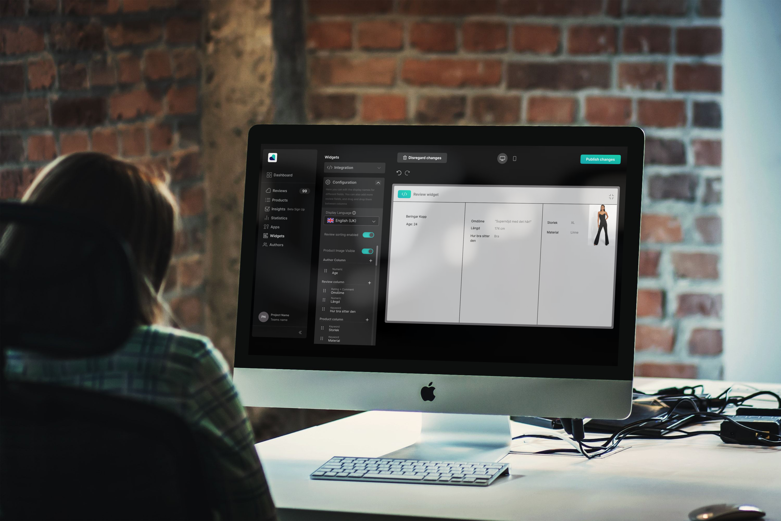
This project was part of a collaboration with Distancify AB, a company specializing in e-commerce solutions. I worked on the Tycka platform — a review management tool that helps online retailers collect and present customer feedback. My focus was the configuration system in the widget editor, where users customize how product reviews appear on their websites.
Challenge
The existing editor offered limited visual feedback and an inconsistent workflow. Users struggled to understand how edits affected the final widget and often lost track of what was saved or published.
The challenge was to restructure the interface and logic to support a clear, predictable editing flow while aligning it with Tycka’s design language and product identity.
My Role
I collaborated with another UX design intern under the mentorship of two senior UX designers at Distancify.
We shared the full UX process — from understanding the problem space to concept development and prototyping.
My responsibilities included:
Synthesizing background material and user insights provided by Distancify
Defining user personas and usage scenarios
Mapping the editor’s workflow and identifying UX pain points
Creating wireframes and high-fidelity prototypes in Figma
Preparing documentation for internal design reviews
Research & Insights
Instead of conducting new user research, we worked from existing company data, internal feedback, and user personas supplied by Distancify’s UX team.
These personas represented typical business users with limited design knowledge, which informed our focus on simplicity and guidance.
Through this material, we identified three key issues:
Low transparency — users couldn’t see how edits affected the live widget.
Overcomplicated navigation — too many steps and unclear hierarchy.
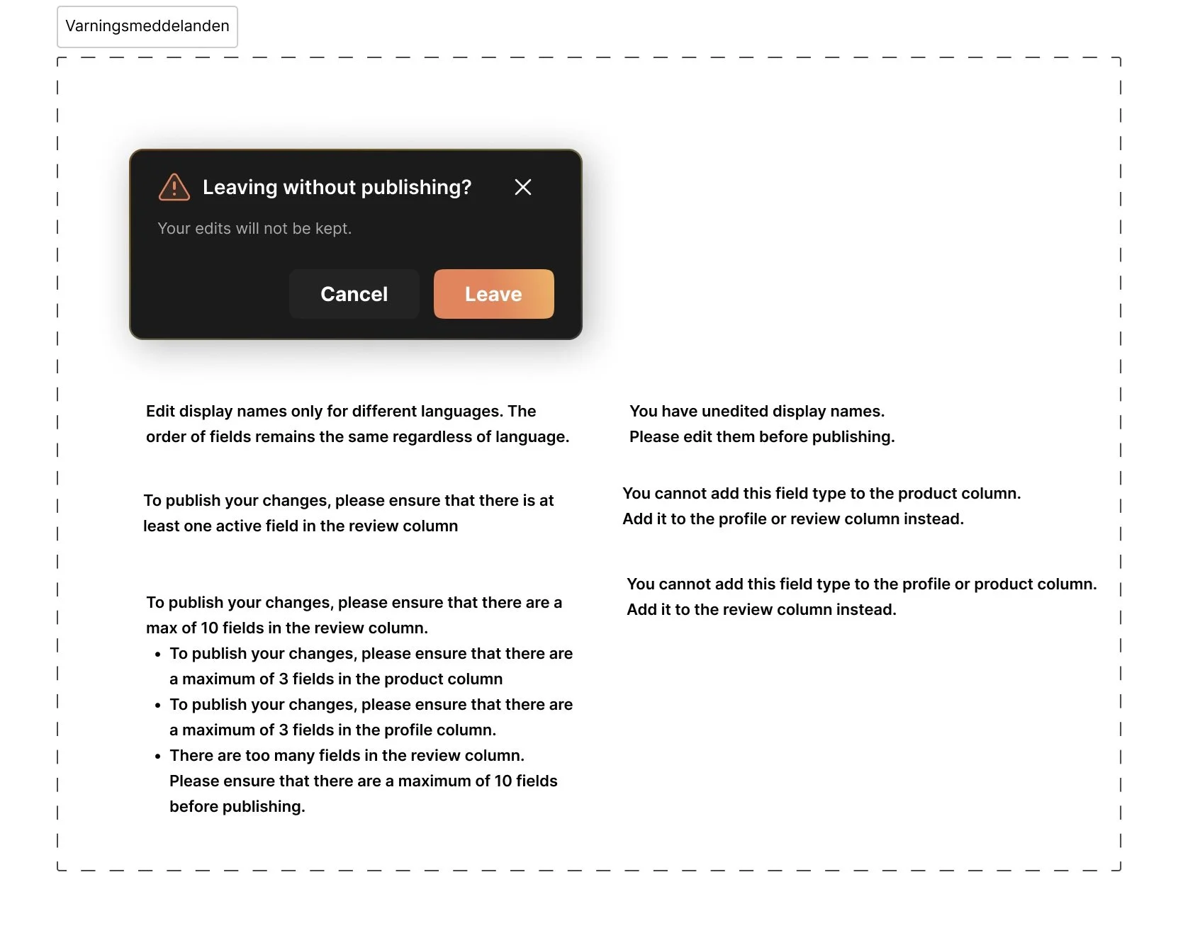
Lack of system feedback — no visual cues for save or publish actions.
These insights shaped our direction toward improved feedback, structure, and clarity.
UX Goals
Streamline the widget creation flow into clear, logical steps.
Improve visibility of system feedback and preview.
Reduce visual noise and cognitive load.
Maintain consistency with Tycka’s visual identity and tone.
Ideation & Concepts
We explored several layout structures focusing on how users transition between Edit, Style, and Publish stages.
Early sketches tested grouping of related settings and separation between configuration and preview areas.
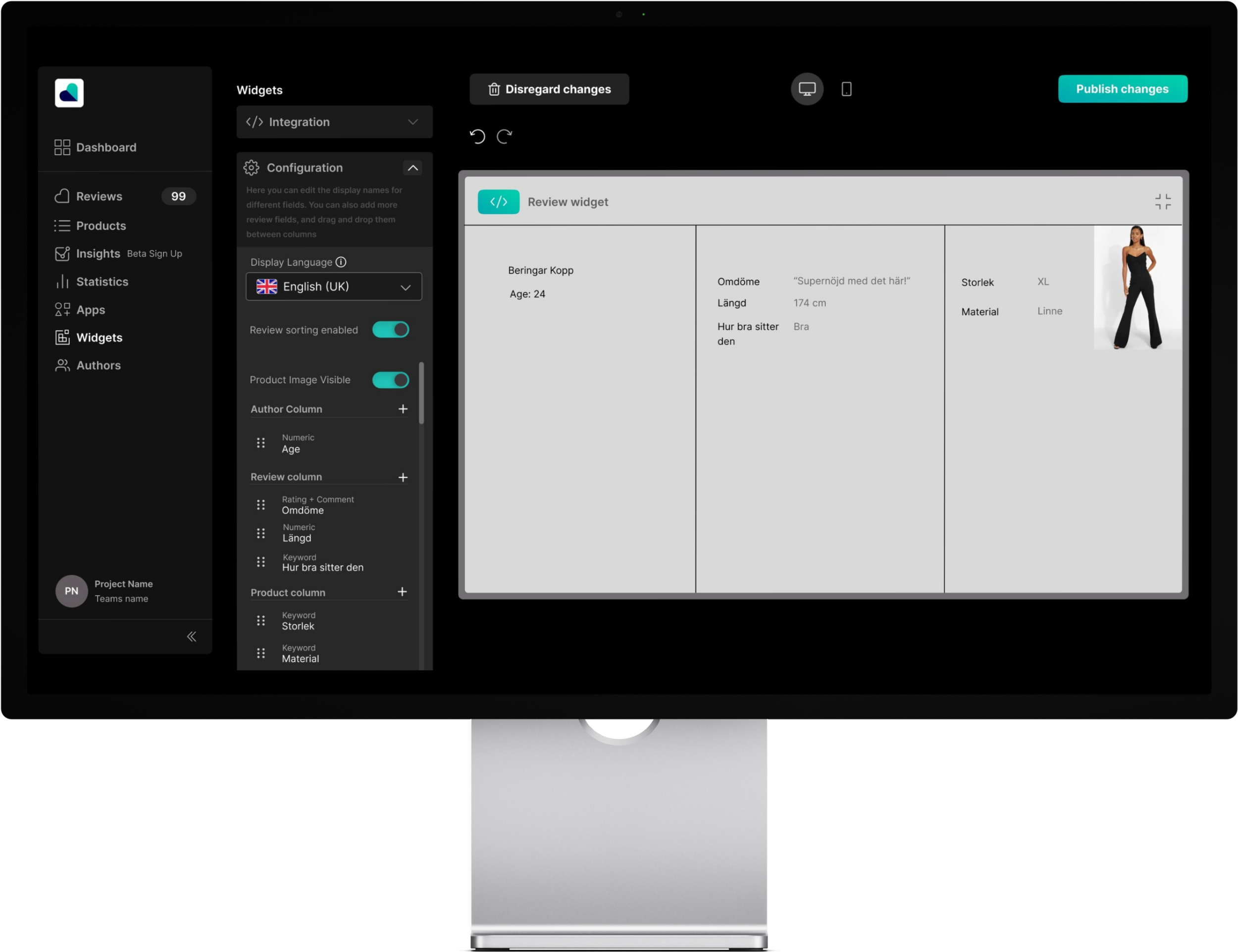
The main concept was to introduce a live, side-by-side preview, ensuring users immediately understood how visual changes affected the end result.
Prototype
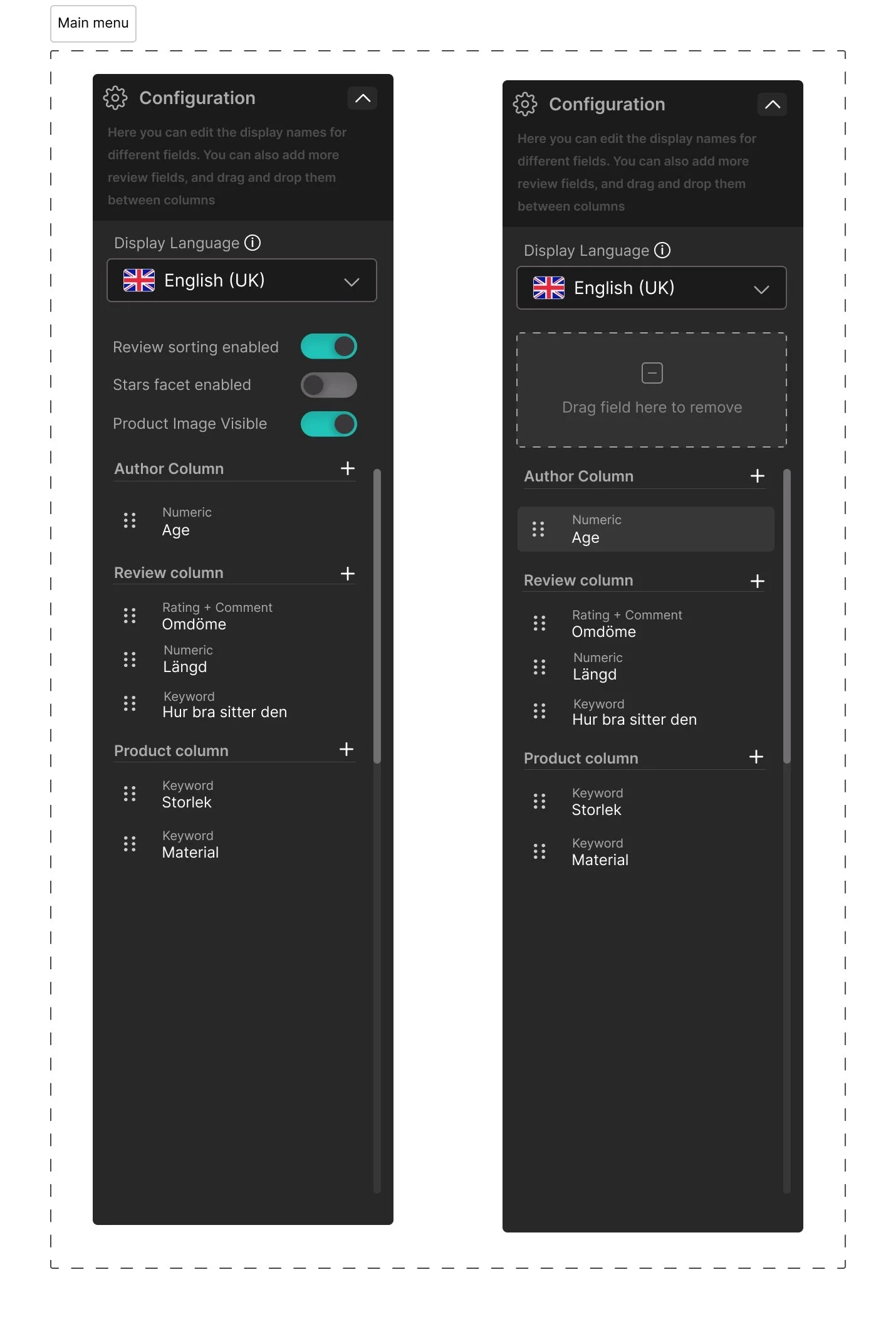
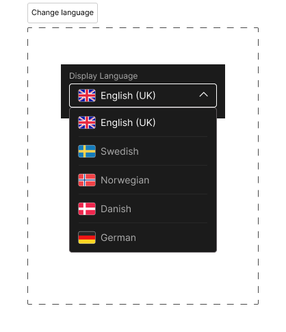
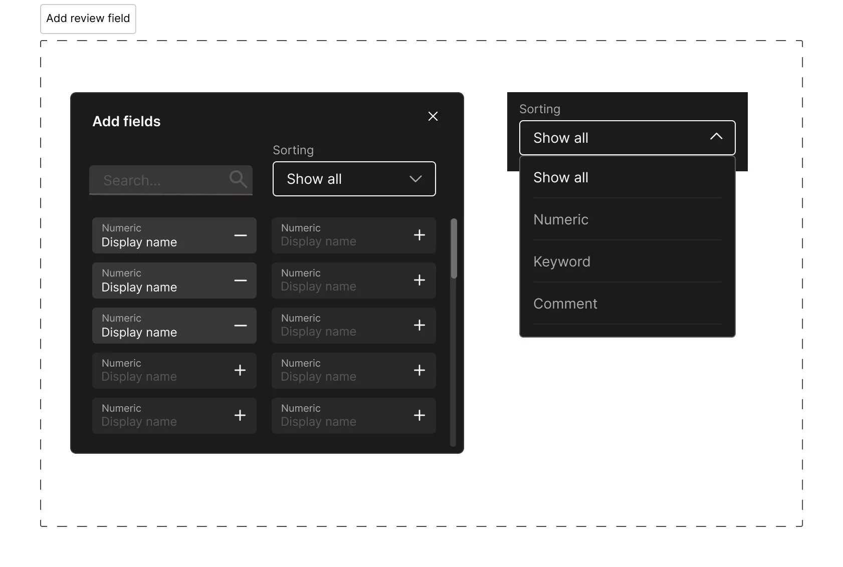
We developed a high-fidelity prototype in Figma that introduced a cleaner layout, reorganized menus, and real-time preview.
Microinteractions were added for saving and publishing to improve feedback and user confidence.
Each step in the flow was visually distinct, reducing uncertainty and improving orientation during the editing process.
Key Learnings
This project showed the value of UX structure and reasoning in situations where primary user research isn’t possible.
Working with existing insights required careful interpretation and prioritization, emphasizing how personas and internal data can effectively guide design decisions.
Outcome
The redesign was positively received by Distancify’s design and development teams and was used as a reference layout for future Tycka interface improvements.
It successfully demonstrated how a focused UX process — even without direct user testing — can transform a tool’s clarity and perceived usability.
Solution
The final design introduced:
A three-step structure (Edit → Style → Publish)
Real-time widget preview
Clear visual feedback for save, error, and publish actions
Simplified navigation and visual hierarchy
The result was a more approachable, low-friction editor experience that helped users move from idea to published widget without confusion.
Reflection & Next Steps
The Tycka project deepened my experience with SaaS platform design and cross-functional collaboration.
If continued, I would run usability testing sessions with business clients to validate assumptions and fine-tune the flow based on real usage data.
This work reinforced the importance of designing for clarity, even in feature-dense tools.

