Product Information Redesign
Client
Didriksons Sverige AB
Year
2023
This project was carried out at the University of Skövde in collaboration with Didriksons, a Swedish outdoor apparel brand.
The focus was to evaluate and improve the usability of Didriksons’ product symbols — small visual indicators communicating properties like water resistance, insulation, and breathability.
The goal was to ensure that users could quickly and accurately interpret these symbols across both digital and physical retail contexts.

Challenge
User feedback showed that many customers misunderstood or ignored the product symbols, which reduced their usefulness as decision-making aids.
Didriksons wanted to understand why this happened and how the visual language could be improved to support better product comprehension and accessibility.
My Role
Collaborated as a UX designer and researcher in a five-person team under academic supervision.
Shared responsibility for research planning, heuristic analysis, usability testing, and synthesis.
Contributed to the redesign proposals and final presentation delivered to Didriksons’ design team.
Research & Insights
We conducted a perspective-based heuristic evaluation and usability testing with participants representing both everyday users and outdoor enthusiasts.
Findings revealed three key pain points:
Symbol meaning was unclear or inconsistent across products.
Icons relied too heavily on prior knowledge of outdoor gear.
Text labels were too subtle to support accessibility.
Through thematic analysis, we identified a gap between brand intention and user interpretation, highlighting a need for clearer iconography and supporting text.
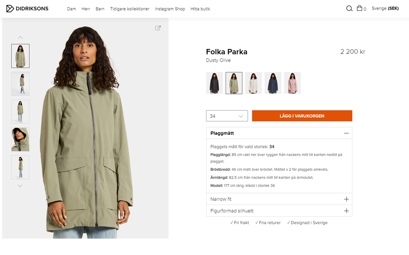
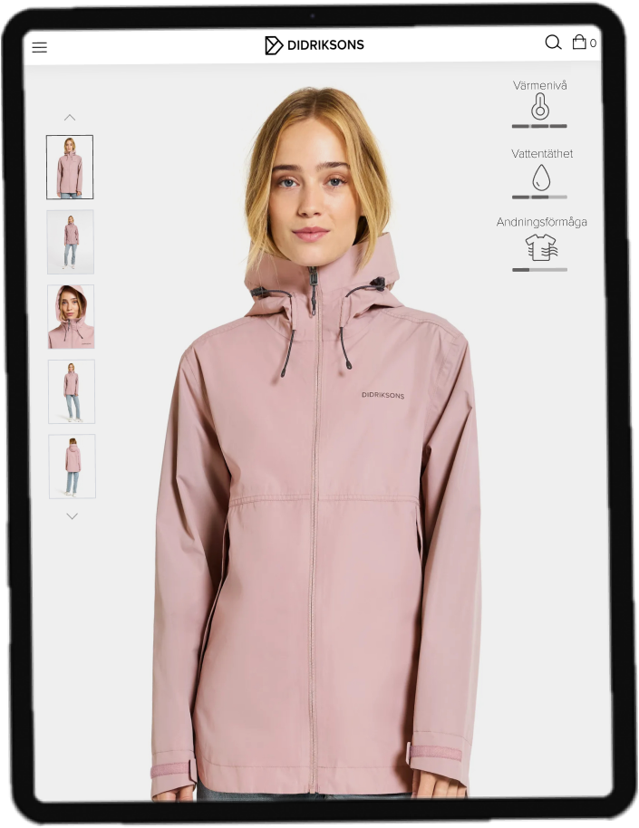
Initial view of Didriksons’ product page before redesign. Symbols for technical properties were visible only after scrolling, limiting user awareness of product functionality during first impression.
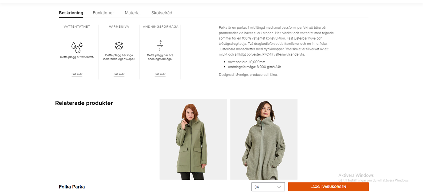
Old visual layout of the technical symbols. The icons lacked clear hierarchy and descriptive context, which often led to confusion about meaning and relevance — key findings that guided the redesign direction.
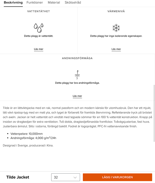
Previous tablet-optimized layout showing technical information below the main product view. While functional, the placement required additional scrolling and lacked contextual connection to the buying flow, highlighting the need for improved information hierarchy.
UX Goals
Increase recognition and comprehension of each symbol.
Improve visual hierarchy and consistency across media.
Support accessibility through clear contrast and labels.
Strengthen Didriksons’ brand communication through cohesive design.
Ideation & Concepts
We explored alternative icon concepts based on established ISO pictogram principles and accessibility guidelines.
Multiple iterations were sketched and compared using heuristic criteria such as clarity, distinctiveness, and visual balance.
Final concept directions emphasized simplified shapes, unified line weights, and contextual tooltips for digital use.
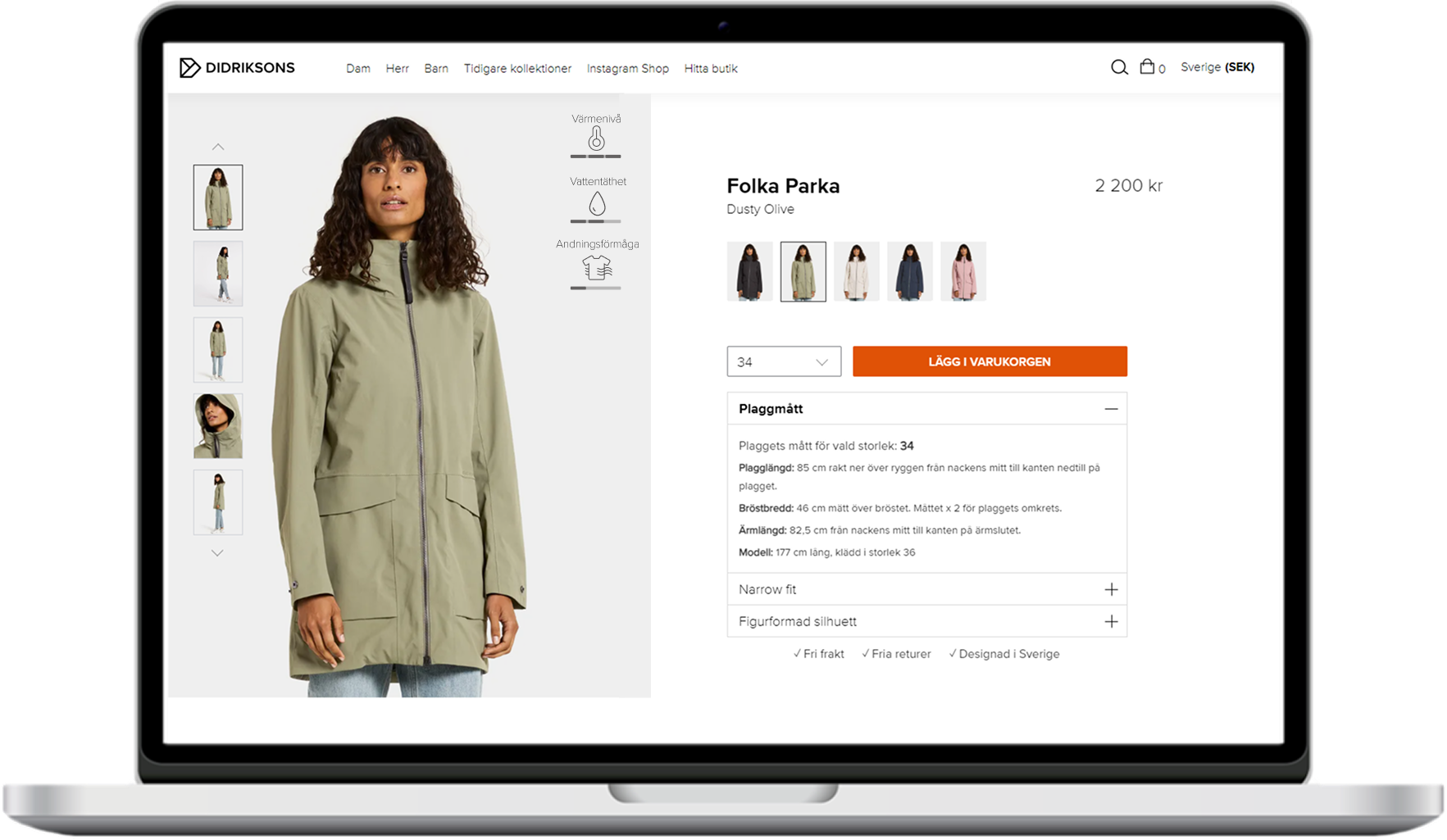
Redesigned product page prototype with repositioned technical symbols. The icons are now visible at first glance, reinforcing product value and aiding decision-making without extra scrolling.
Optimized for mid-sized screens, maintaining visual hierarchy and spacing for better readability. The technical indicators were simplified and aligned for consistency across devices.
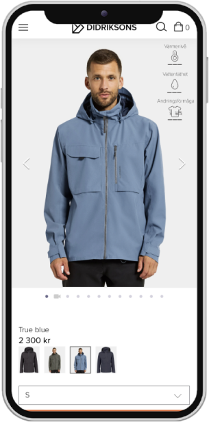
Responsive mobile prototype showcasing compact yet legible icon placement. The new layout ensures that users can access key technical information efficiently, even on small screens.
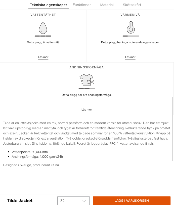
Reworked visual system for technical attributes. The new icons and labels provide immediate clarity on product functionality, aligning with Didriksons’ brand language and enhancing user trust at the decision stage.
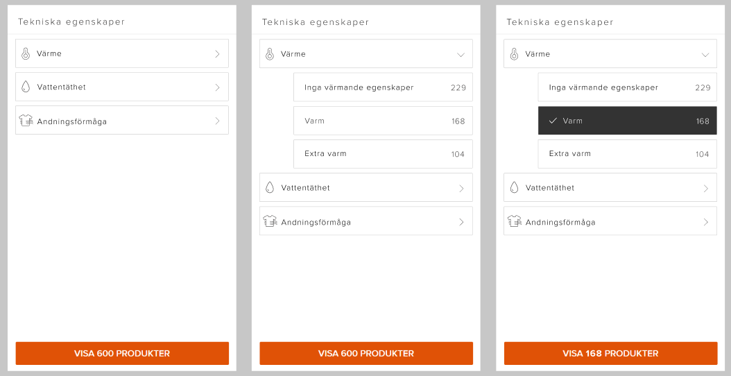
The redesign introduced a new filtering system for technical attributes such as warmth, waterproofness, and breathability. This addition improved product discoverability and allowed users to narrow down results based on key performance features.
Key Learnings
Visual simplicity doesn’t guarantee comprehension — context and explanation matter.
Brand consistency must balance aesthetics with functional clarity.
Accessibility considerations are essential even for small design elements.
Outcome
The final deliverables included:
A redesigned icon set with clear semantic grouping.
Recommendations for consistent application in e-commerce and print.
A detailed usability report shared with Didriksons’ internal design team.
Feedback from supervisors and industry mentors confirmed improved clarity and alignment with accessibility best practices.
Solution
We proposed a refined visual system combining updated icons, improved text integration, and a scalable design structure adaptable for both web and packaging.
This redesign aligned symbol semantics with user expectations while maintaining Didriksons’ minimalist brand aesthetic.
Reflection & Next Steps
Future work could include A/B testing of icon sets in a live retail context and integrating micro-interactions on digital product pages to reinforce meaning.
The project strengthened my understanding of information design, semiotics, and applied accessibility in UX communication.